Bringing a century-old identity back to one confident system.
Challenge
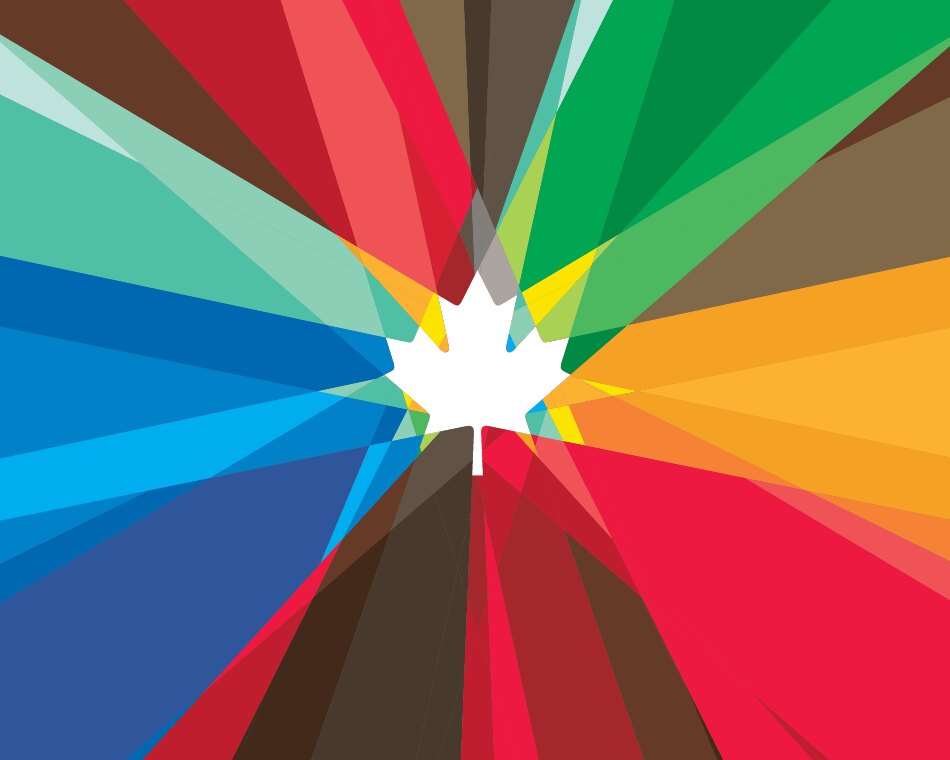
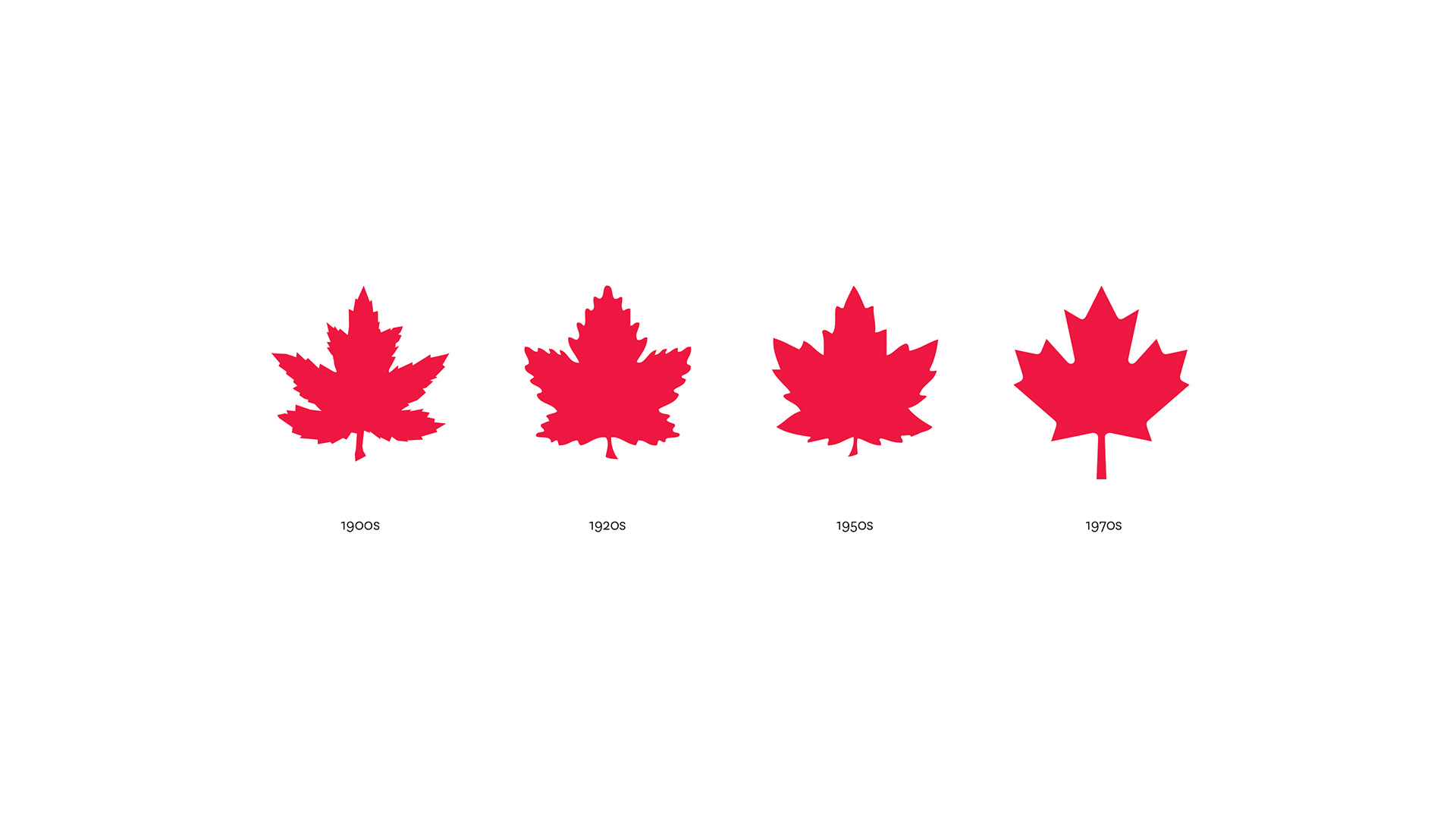
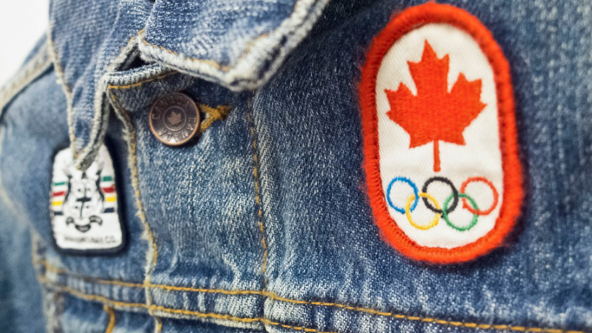
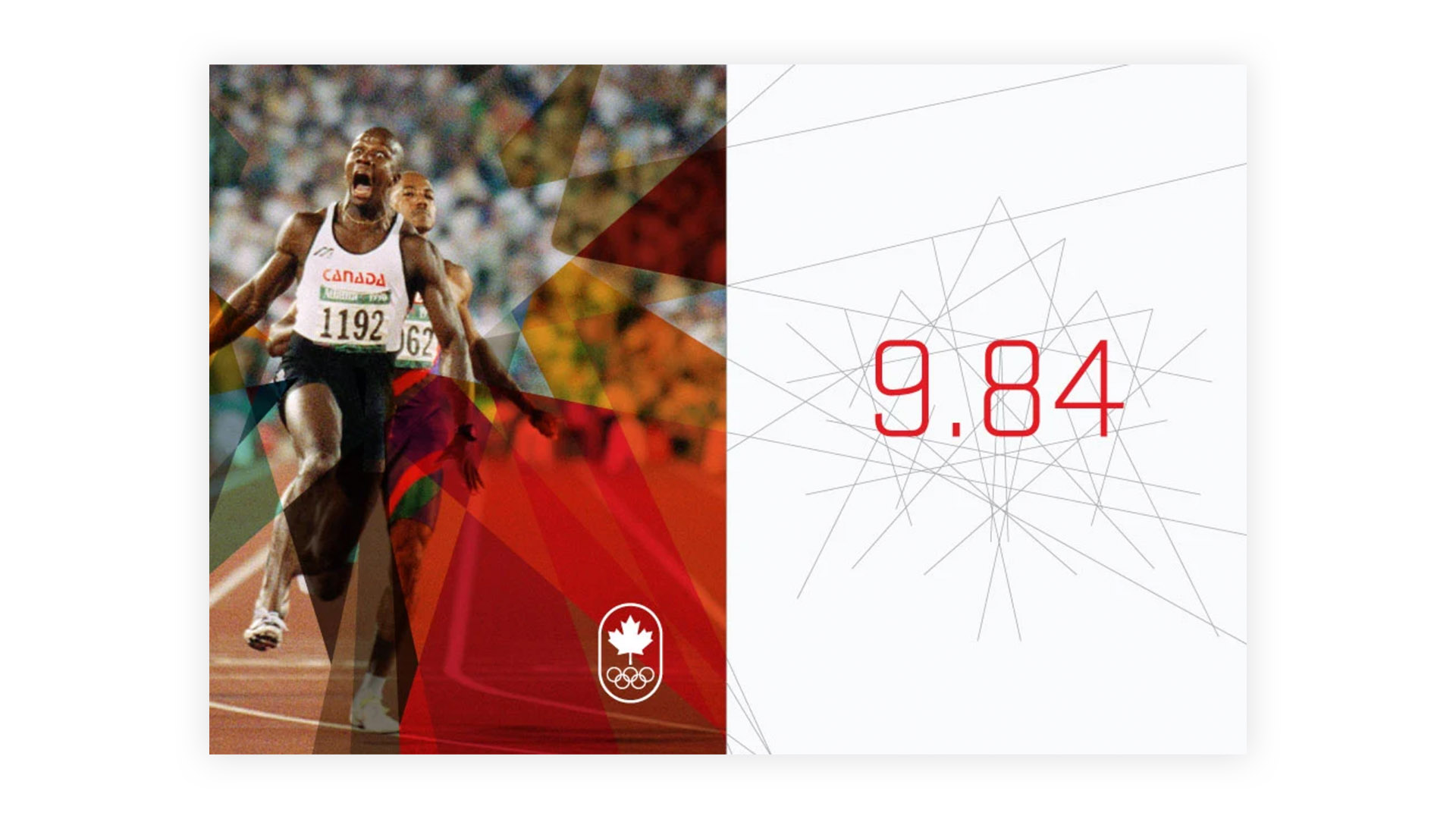
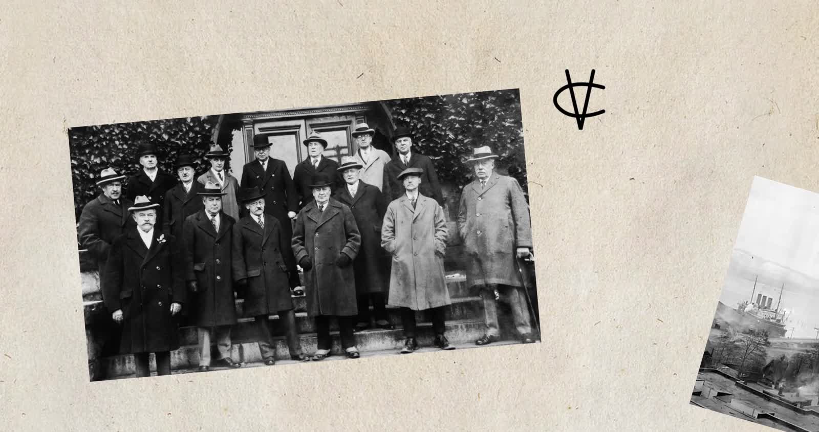
The Canadian Olympic Team had worn the maple leaf since 1908, when Canadian athletes first carried it to the London Games, nearly 60 years before it became the single icon on the national flag. A century of use had splintered it into dozens of marks that no longer agreed with one another, and the public face had drifted to the Committee rather than the athletes. The Canadian Olympic Committee needed to put the Team back at the centre and give the whole organization one identity that could hold for decades.
Approach
I had missed my connection home and was stuck overnight at Schiphol, alone in an airport bar, when Ben Hulse called and asked how I was doing. I told him, at length. He said, “Well, perhaps I can brighten your day. How would you like to help us rebrand the Canadian Olympic Team?” The next day I joined Ben, Greg Durrell and Andrew Simpson back in Canada and we got to work.
We treated it as much as restoration as design, spending time in libraries and in conversation with historians and Olympians, defining what the Team stands for and where it came from. The aim was an identity that felt inherited rather than newly invented. A flexible architecture let every sport, program and partner sign consistently, and the familiar maple leaf gave the organization an internationally recognizable mark with a vibrant graphic system drawing from the tones of the five Olympic rings and the colours of the Canadian landscape.
Outcome
The system gave the COC a single identity for the entire Team, built to carry it for decades. The work was recognized at the Brand New Awards in both 2010 and 2011, and the Committee described the result as new life for a brand over a century old.
“From the choice of typography to the development of the core system of lock-ups, this work is an exercise of both great restraint and great vision. It would be easy to overlook the painstaking design decisions and attention to detail that is present here, as it feels like these graphic examples have existed for centuries. This is not to say this branding is boring, but rather timeless and appropriately foundational.”Armin Vit, Brand New
02Product · Data Visualization · Creative Direction
SAP · McLaren F1
Turning a flood of race data into decisions the pit crew can act on in real-time.
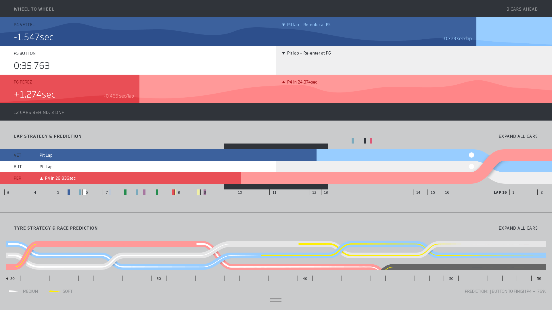
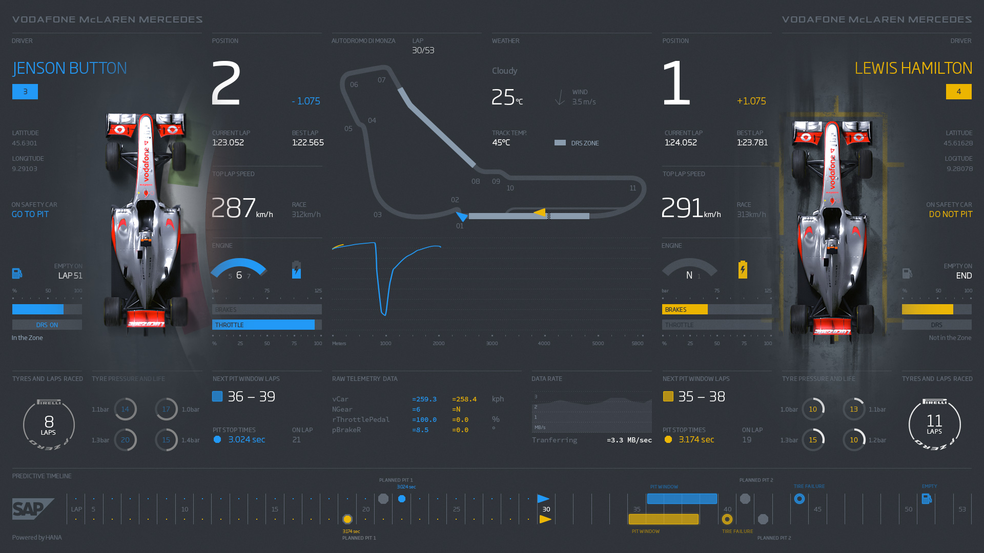
Challenge
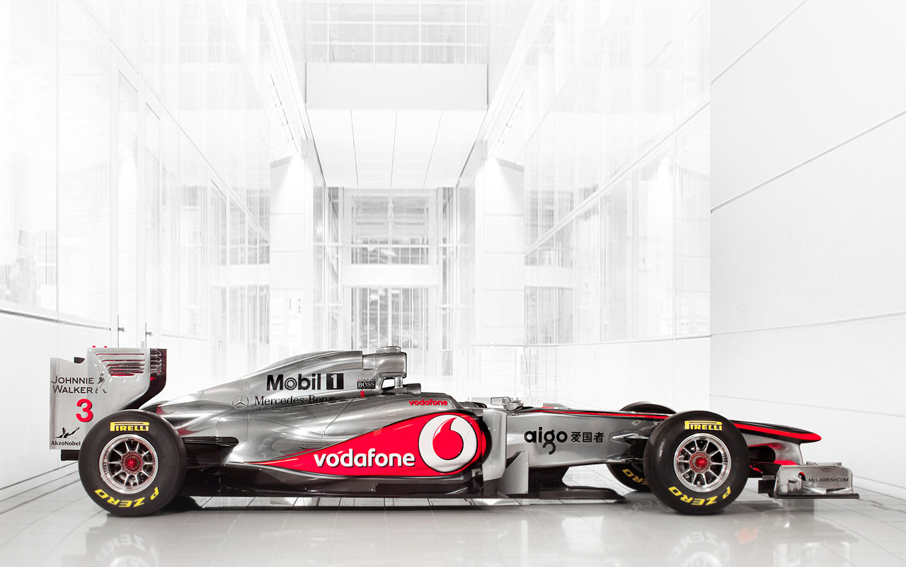
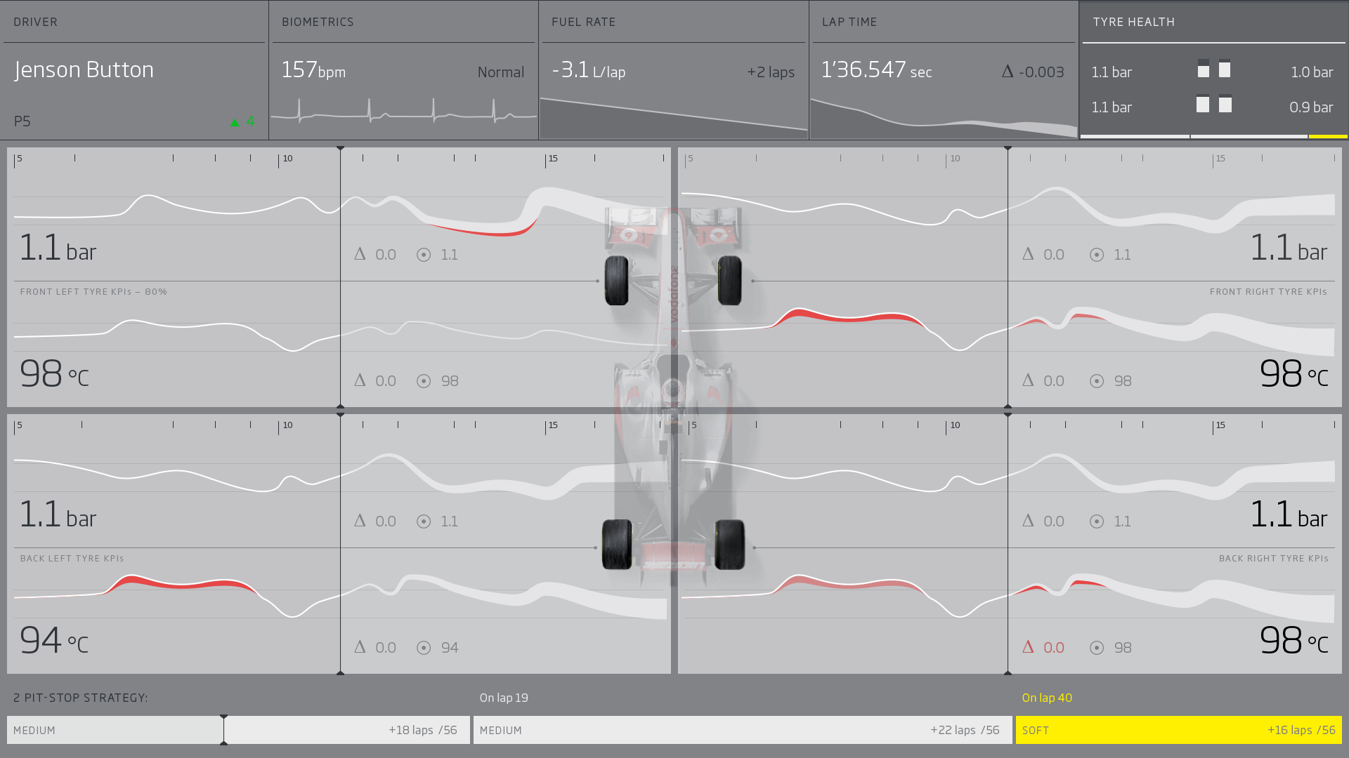
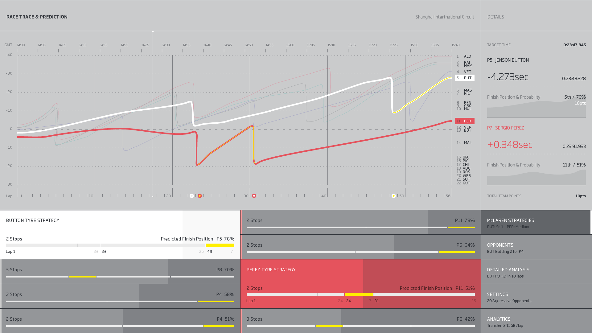
SAP’s HANA platform could process McLaren’s race data roughly 14,000 times faster than the systems it replaced, but speed alone changes nothing if the engineer on the pit wall cannot act on it in time. SAP and McLaren needed to find a way to enable real-time decision making through predictive analytics during a race.
Approach
I led creative direction and the data-visualization design. Our governing rule was that the software should do the arithmetic and the strategist should make the call, so every screen was built to empower the pit crew to make decision rather than displaying a torrent of stats and data.
We designed three connected views. Race Strategy predicts which drivers are genuinely competing for a position once differing tyre strategies are accounted for. Car Status turns the MP4-28’s 150-plus live sensors, including tyre health on a contact patch no larger than a sheet of paper, into gauges legible at a glance. Race Trace charts actual and predicted lap times against a target and models alternate pit strategies as the race develops.
Outcome
The system became flagship innovation work for SAP and as well as a film I directed and produced, showing a global audience how predictive visualization changes the sport. The decision-led approach to dense data carried into enterprise and product projects for years afterward.
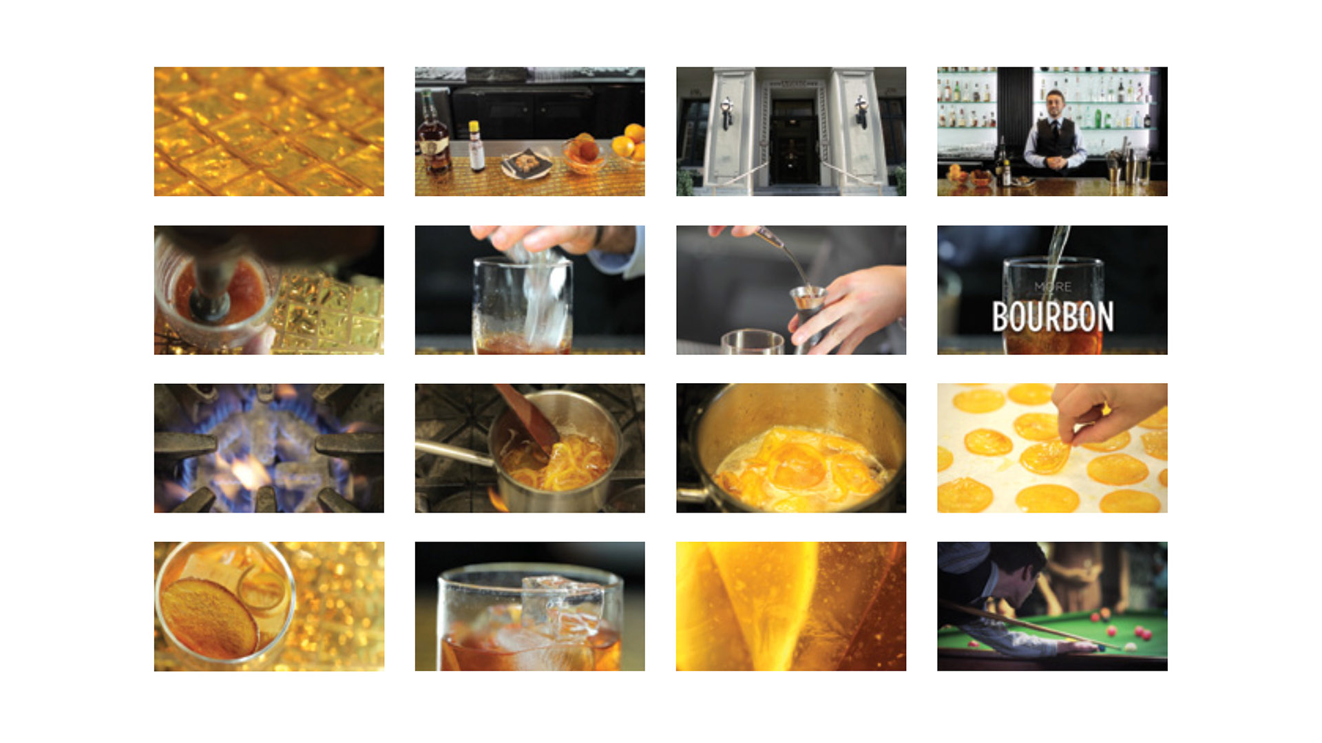
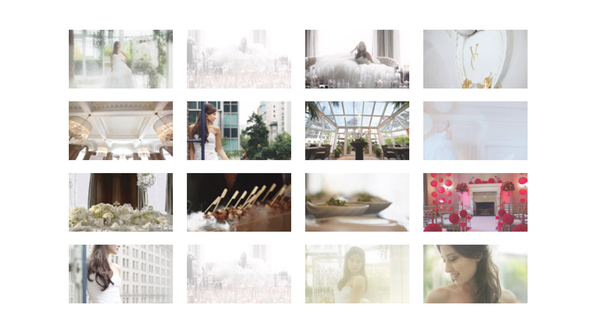
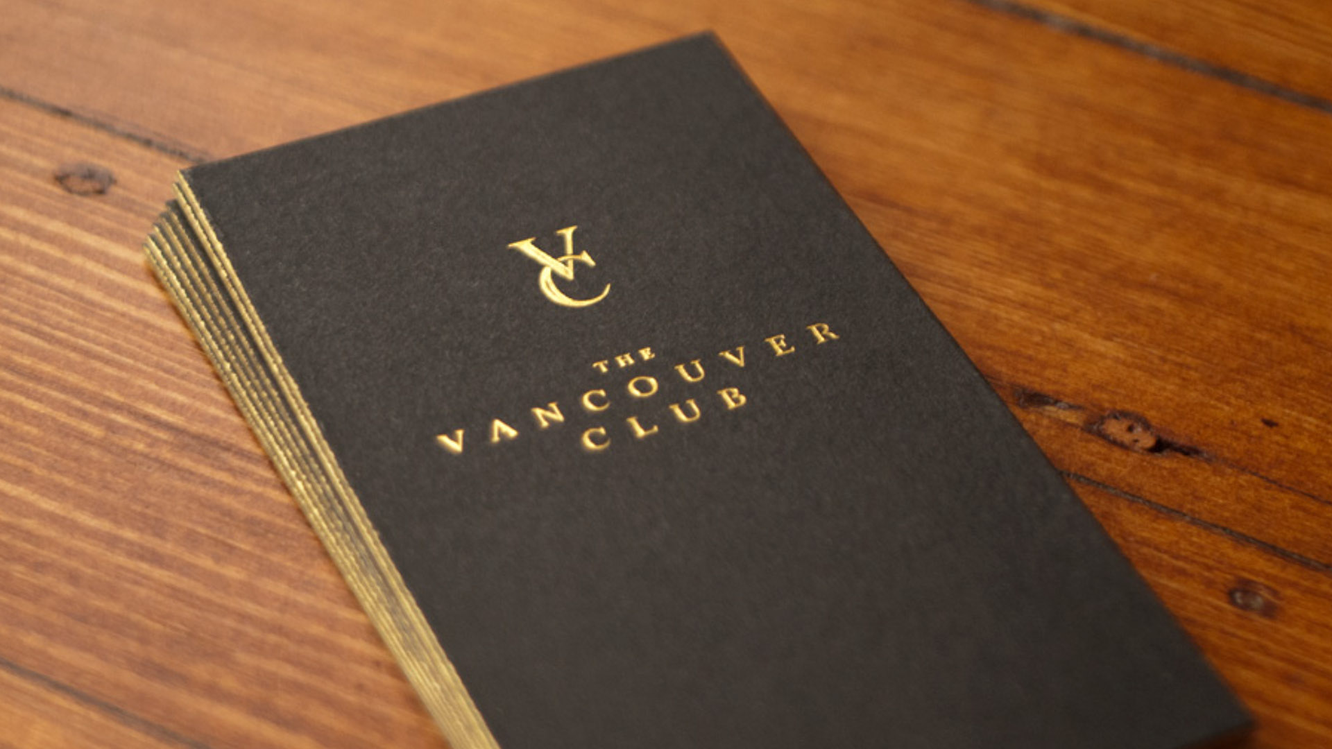
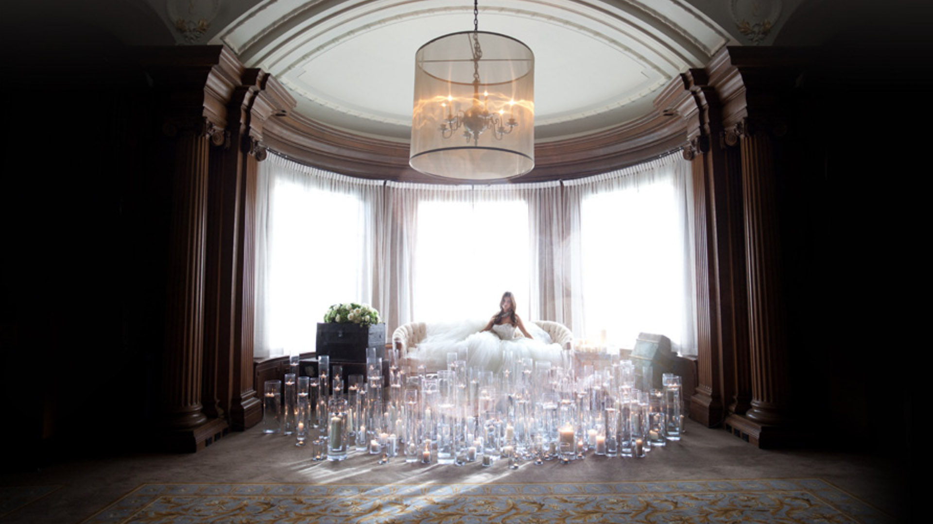
03Brand · Creative Direction · Photography & Film
The Vancouver Club
Making a 130-year-old club somewhere a younger generation wanted to belong.
Challenge
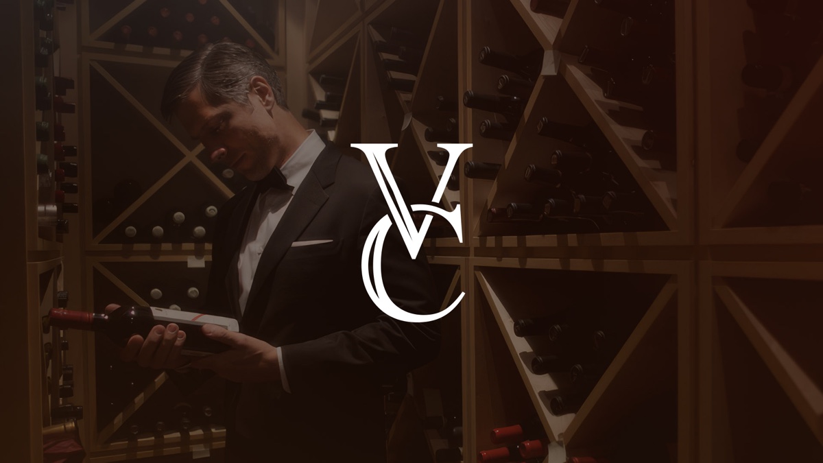
The Vancouver Club has been one of Canada’s most distinguished private clubs since 1889, but its membership was aging out and public perception was that it was an old boys club. It needed to attract a younger, more diverse generation without alienating their existing membership.
Approach
After speaking with many members and younger prospective members we found that they were actually looking for a sense of history and authenticity. Gastown was full of bars and restaurants trying to manufacture a sense of place and heritage meanwhile The Vancouver Club had it in spades. It was just a matter of reframing it as elegant and sexy instead of old and stuffy.
We kept the crest, the archive and the sense of occasion, and made the club feel warmer, more current and easier for a prospective member to picture. Over close to a decade I worked as creative director, lead designer and producer across campaigns, photography, film and the digital presence, holding heritage and contemporary appeal in the same frame.
Outcome
The work moved the metric that mattered most. New membership shifted from predominantly men over 55 to a group that skews under 35 and is considerably more balanced, a meaningful repositioning for an institution of its age.
“Throughout the process, they were listeners. They came in and wanted to hear my story. And for a long time, they didn’t say anything back. They just listened, to me.”Philip Ireland, General Manager, The Vancouver Club
04Klue · Design & Brand Systems · Product
Nectar Design System
Navigating legacy systems, future needs and organizational change.
Challenge
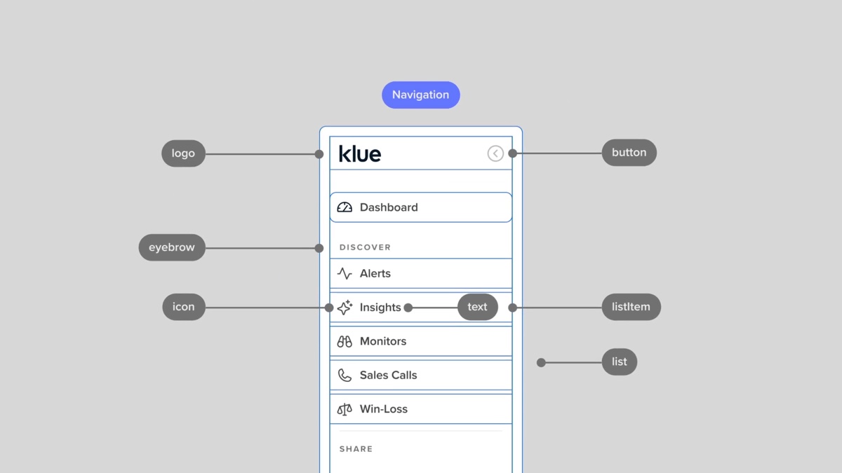
Klue’s product had grown quickly, and the interface showed it, with duplicate components, legacy patterns, and a widening gap between what designers drew and what engineering shipped. The goal was to give both teams one dependable source to build from.
Approach
Under my direction the team built Nectar, Klue’s design system, on a principle of reduce, then refine. We cut duplication first, then hardened what remained and documented it so usage was never a guess.
We rebuilt the core components for reliability and clarity. The button component alone went from 63 variants to 12, governed by explicit rules, accessible patterns and a considered set of design tokens, with variants across the wider library reduced by more than half. The work was largely invisible to customers, which is the point, because it is the foundation that lets everything visible move faster.
Outcome
Once the system was real, delivery on the work we measured improved by roughly 30 percent, and every new component had a standard to meet. Nectar became the foundation that both the brand refresh and the product vision were built on.
05Brand Strategy · Architecture · Messaging
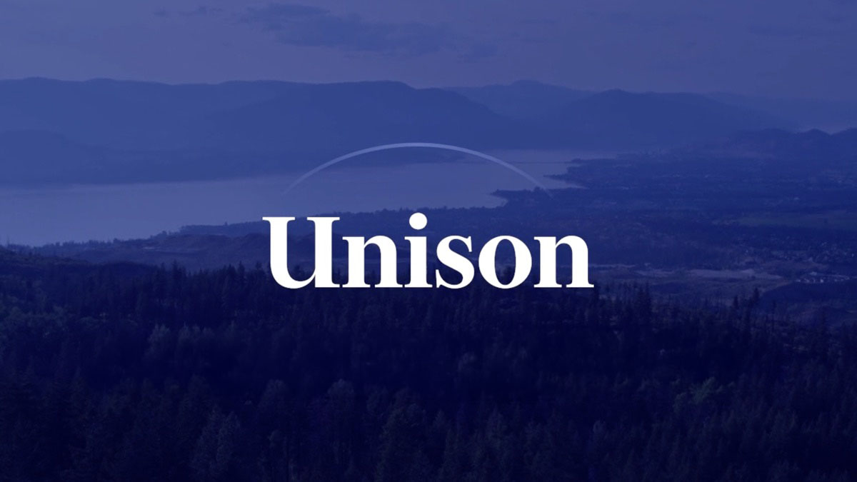
Unison
One brand to unite several of BC’s leading brokerages, without diminishing any of them.
Challenge
Several founder-led luxury brokerages, among them Jane Hoffman Realty, HM Commercial Realty and the John Ryan Group, wanted to combine forces and share infrastructure. Each had spent decades building its own name, and none was prepared to disappear into a parent brand. The umbrella had to add real weight without flattening what made each one worth joining.
Approach
I positioned Unison as the connector rather than the lead, substantial enough to add value and restrained enough to keep each affiliate in front of the client. The promise was operational, not cosmetic: in-house marketing, legal and administrative support at a ratio well above the industry norm, and a partnership structure modeled on a law firm, built for succession and multi-generational growth rather than a one-time sale. The tone throughout was quiet confidence, generations of local expertise that does not need to announce itself.
I built the brand architecture so Unison sits as a consistent layer beneath the affiliate brands, present on every touchpoint while the affiliates lead. That meant a lockup system pairing the Unison mark with each brokerage and written to satisfy BCFSA advertising rules, plus a messaging framework covering the mission, five pillars and a tone of restraint over hype. The organizing line, Thriving in Unison, carried into the identity, a Freight Display and Quire Sans type system, and a brand film we produced.
Outcome
Unison launched with a coherent story, a defensible position against the global names that offer reach without local depth, and a system the whole network applies consistently, from recruiting a new founder to marketing a single listing. Each affiliate kept its independence and reputation, now backed by infrastructure it could not have built alone.
06Brand System · Product · Creative Direction
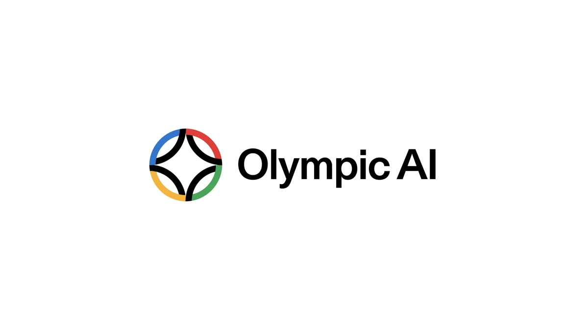
Olympic AI
Giving the IOC’s first AI assistant a presence that still read as Olympic.
AIIOC Digital Assistant
Challenge
The IOC was preparing to introduce an AI assistant across its digital ecosystem, in chat, in search, and in the summaries layered onto articles and athlete profiles. It needed an identity that read as unmistakably Olympic while suiting a kind of product the brand had never had before.
Approach
The work resolved into three parts that had to operate as one: the identity itself; a web interface kit, including the chat window, prompt field, response area and controls, in modal, sidebar and full-page layouts; and a voice mode, a subtly animated variant of the same form. Everything was designed to live within the existing IOC brand.
Outcome
The result is a single assistant with a consistent presence across text, interface and voice, prepared to scale across the Olympic Movement’s digital touchpoints as its first consumer-facing AI.
07Product Design · Brand · Creative Direction
Yard Sign Social
Finished listing posts for realtors in about ninety seconds.
Challenge
Realtors are poorly served by general social tools. Buffer does not understand a listing, and Canva requires designing each post by hand, neither of which suits an agent moving between showings. The job is narrow and repetitive: get listing posts out, on brand, with as little effort as possible.
Approach
I built Yard Sign around a single promise, that pasting a listing link returns a finished, on-brand Instagram post in about ninety seconds, and designed it largely by deciding what to leave out.
Paste a URL and it imports the photos, price, beds, baths and address automatically. It applies the right status badge for each stage of a deal, from Coming Soon to Just Sold, so one listing yields a series of posts. It reads an agent’s logo, colours, fonts and writing style from their website, then schedules the week to Instagram. I led the brand, the product and the marketing site.
Outcome
The result does one job well, with a clear advantage over the tools agents tolerate today. It is in free early access, building a waitlist ahead of launch.
08Brand · Identity
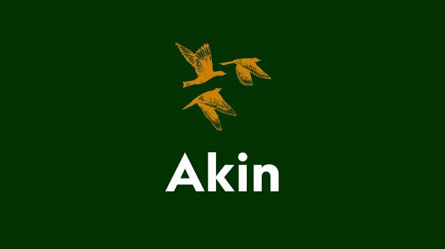
Akin
A brand for a Kelowna community that reads as modern without feeling cold.
Challenge
Akin is a residential community in Kelowna that needed a brand both progressive and grounded in family, safety and belonging. In the client’s own words, the brief was high end without being fancy.
Approach
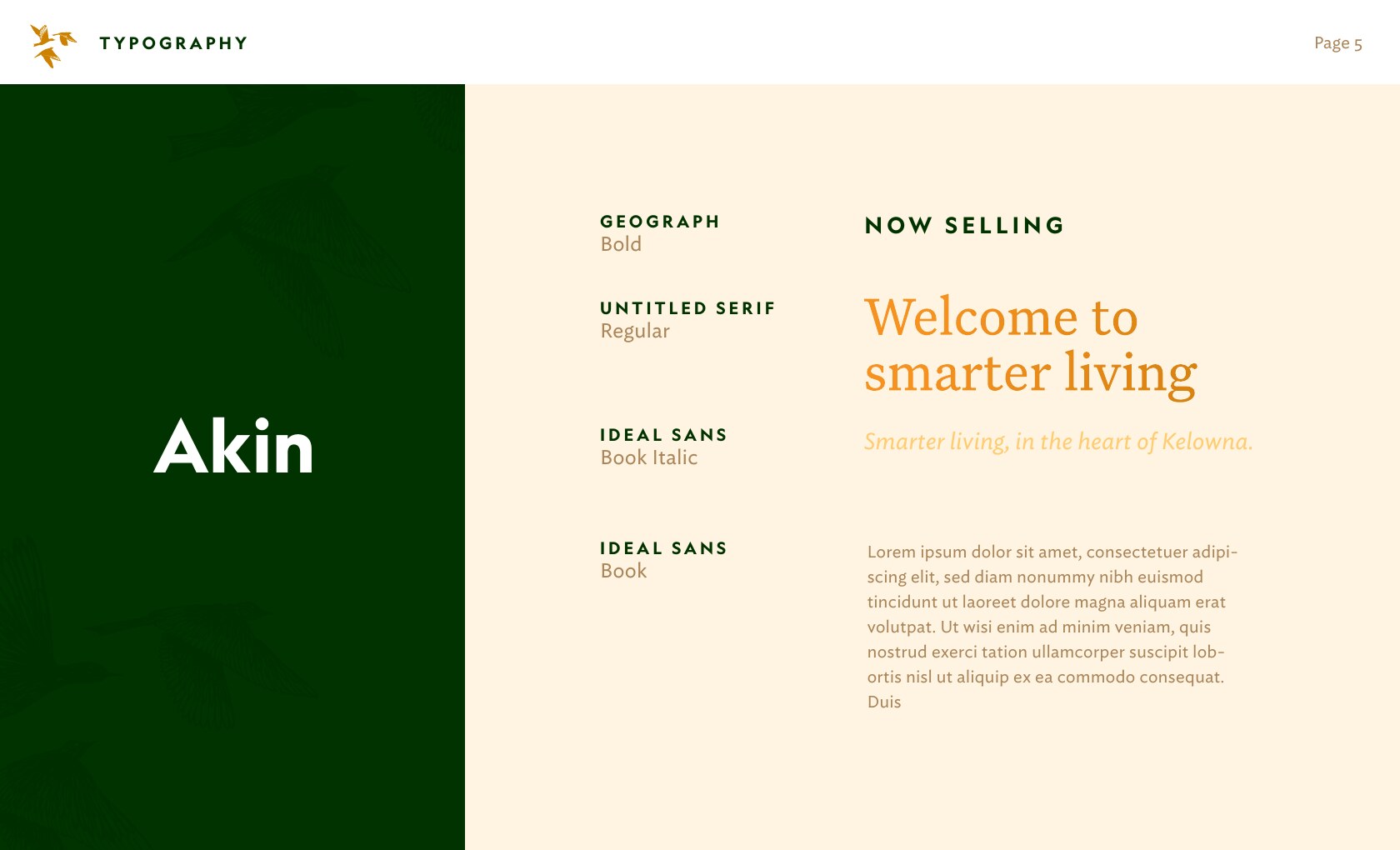
We anchored the identity in five values, smart, community, hospitality, security and quality, and let them set a tone that is confident and warm at once.
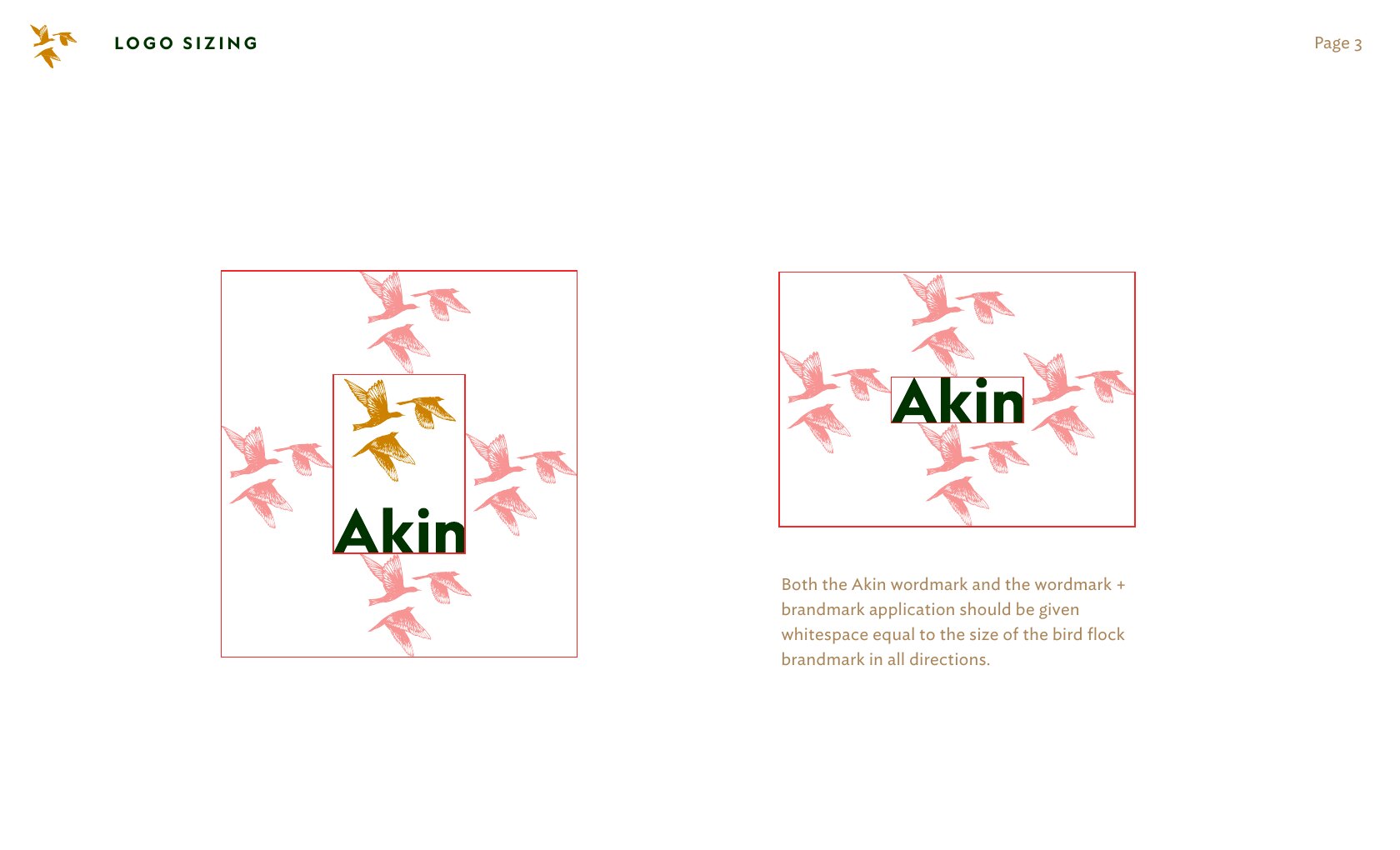
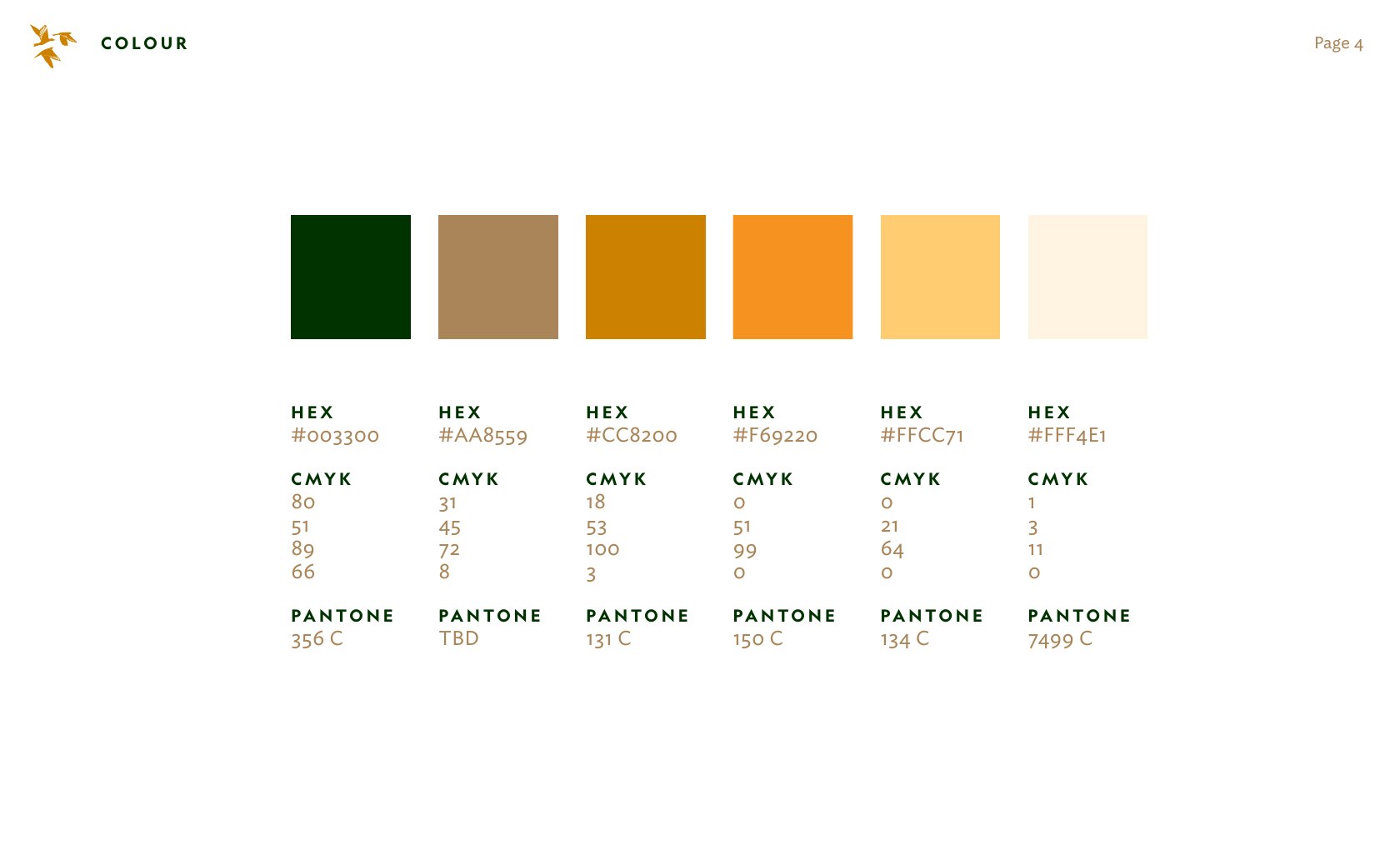
The design decisions followed from the values. The brandmark is a small flock of birds, a quiet reference to kinship rather than a literal house. The palette runs from deep forest green to soft cream so the brand feels settled and a little aspirational. We drew the mark in full and simplified forms so it holds up from architectural signage to stitched thread, and anchored the voice in the client’s own line, smarter living, in the heart of Kelowna.
Outcome
The result is a complete, ownable identity and voice that gives Akin a more human position in its market, with a system ready to scale across signage, print and digital.
09Direction & Production · Brand Film
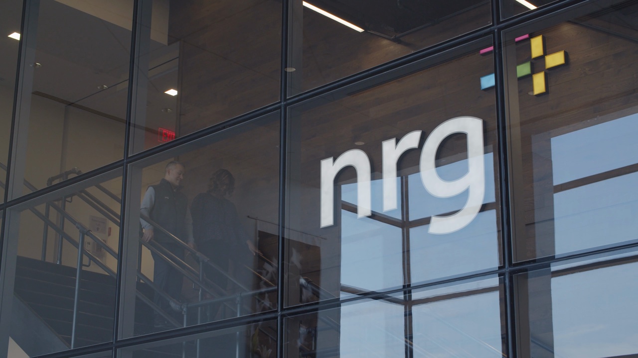
NRG Brand Film
A cinematic anthem for an energy company recruiting against the tech giants.
Challenge
NRG is one of the largest energy companies in the United States, and it was competing with the technology giants for the same engineers and operators. The brief was to present its plants, people and work as modern, sophisticated and genuinely cinematic, behind the line at the centre of the brand: realize the potential of energy, together.
Approach
We built the film around a clear arc, moving from the natural environment, to the scale of the infrastructure, to the people who run it, with the company’s mark woven into the imagery. The reference for tone was a NASA mission film: precise, a little proud, and delivered in plain language rather than overstatement.
To reach the production value the story required, we shot in 4K across a range of real NRG facilities, spanning natural gas, wind, solar, coal and nuclear sites, with helicopter aerials and an original score. We structured a single production to deliver two films, an external recruiting anthem and an internal onboarding piece, to get the most from the shoot.
Outcome
The result was an anthem with the polish to stand beside the technology brands NRG was recruiting against, and the relationship continued across further films in the years that followed.
10Direction & Production · Recruiting Film
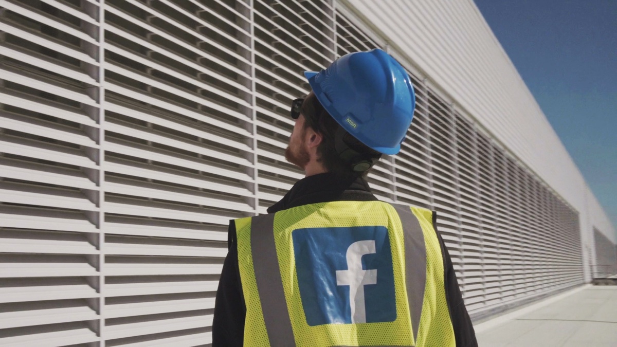
Facebook Data Ops Film
A recruiting film that let a data center’s own people make the case.
Challenge
Facebook needed to recruit local talent to staff a data center, drawing people from a wide range of backgrounds into technical and operations roles. A generic corporate video would not have been convincing.
Approach
We decided the most credible voices were the employees already doing the work, so we built the film around honest, on-camera interviews rather than scripted claims.
We structured the interviews around the questions a prospective hire actually has, about what the work is really like, who their colleagues are, and how a career there can grow, then shot the campus and the work to a standard that matched the brand. The aim was for the film to feel like the place, not an advertisement for it.
Outcome
The interview-led approach gave the film its credibility. It presented the data center as a serious career rather than a job, and gave Facebook a recruiting piece grounded in the experience of its own team.
11Direction & Production · Educational Content
Flow
Entertaining marketing and educational films, plus MovingUI, a publication on animation.
Challenge
Flow needed marketing that felt like the product and educational content people would actually choose to watch. In a category where product content is usually functional and quickly forgotten, the work had to teach without being dry.
Approach
I treated the content as entertainment first. The marketing films set the tone, and the educational series taught real technique with a sense of humour, so viewers stayed to the end and came back for the next one.
I directed, produced and edited a run of marketing films and an educational series, and created MovingUI, a publication on animation that gathered the thinking in one place. Each piece was built to stand on its own and to work as part of a library people could keep returning to.
Outcome
The result is a body of work that does two jobs at once, marketing the product and teaching the craft, with MovingUI giving the ideas a home that outlasts any single video.
12Direction & Production · Commercial Film
Commercial Film
I direct and produce the films, not only design the brands they belong to.
Challenge
A brand is most persuasive when people feel it, and film is one of the most effective ways to make that happen. Clients come to me for a story that connects and a production that reliably ships, from camera through final cut.
Approach
I work end to end, shaping the concept and script, running the shoot as director and frequently as camera operator, and leading the edit. Because my background is in design and brand, the films stay true to the identities they belong to.
The reel spans sport, technology and consumer work, including the Tokyo 2020 One Year To Go Olympic film, Klue’s Series B announcement and Times Square moment, the Team Canada and SAP McLaren pieces, and brand films for NRG, Bria Communities, Discovery’s Shark Week, Classmate, Flow and Arc Energy.
Outcome
The briefs differ, but the assignment is consistent: announce the raise, launch the brand, and put the work on the largest screen available.
About
25 years of making the logo bigger.
I solve problems through design and communication. For twenty-five years I’ve worked as a brand strategist, design leader, creative director and producer, most recently as Director of Design at Klue and, since 2009, as co-founder of my Vancouver studio, The Still. I studied interaction design at SFU’s SIAT and hold a Masters in the same from Malmö University in Sweden. When I’m not working I love exploring our backyard on bikes, boats and splitboards.
Experience
Director of Design, Klue
2022–2025 · Vancouver
Set the creative vision and product-design strategy, grew the design team, and refined the brand, the Nectar design system and the core product.
Co-Founder, Creative Director & Producer, The Still
2009–Present · Vancouver
Creative director, lead designer and producer for clients including the Canadian Olympic Team, SAP, Adobe, McLaren F1 and The Vancouver Club, along with many startups.
Instructor, Vancouver Film School
2016–2019 · Vancouver
Wrote and taught an introductory visual design course in the Digital Design program, and mentored students on their thesis work.
Founder & Lead Designer, Adam Bognar Design
2000–2009 · Vancouver
Freelance design and branding for clients including MTV, Microsoft and American Express, plus more than a hundred small businesses.
Awards
2011
Comprehensive Identity Program
Brand New Awards, for the Canadian Olympic Committee work at The Still
2010
Comprehensive Identity System
Brand New Awards, for Team Canada
Education
MA, Interaction Design
Malmö University · 2006–2008
BS, Interaction Design
SIAT, Simon Fraser University · 2002–2005
Photography workshop with Steve McCurry
New York · 2003
Contact
Let’s build something worth remembering.
Available for brand, product and film work through The Still. Based in Vancouver, working internationally.


 Armin Vit, Brand New
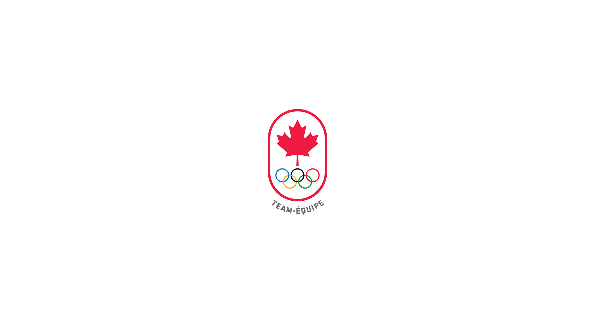
 Philip Ireland, General Manager, The Vancouver Club